Analysis Plots
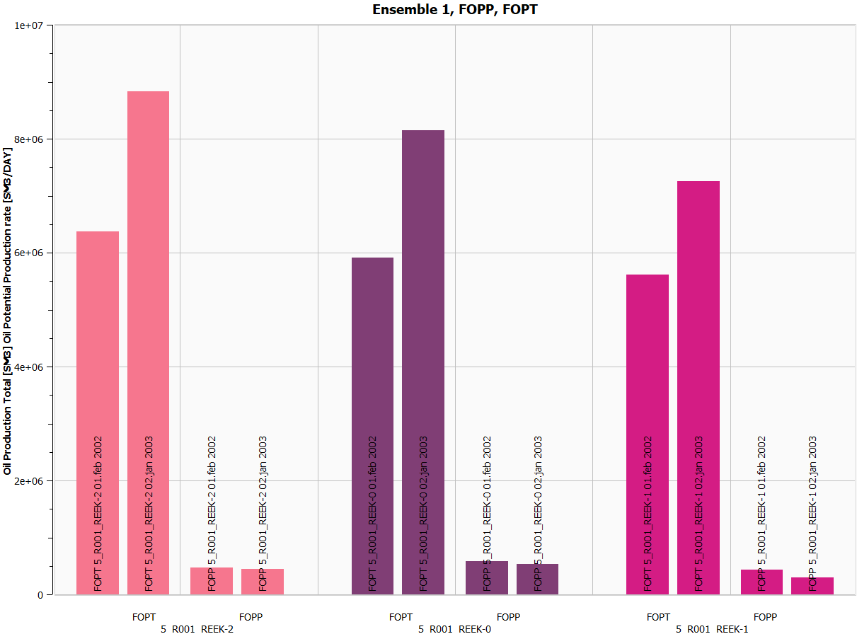
Analysis Plots are bar charts used to compare summary data at specific timesteps across Ensembles and Summary Cases.
Creating an Analysis Plot
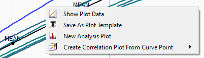
The most convenient way to create an Analysis Plot at a given time step is often to right-click an Ensemble Plot and invoke New Analysis Plot as shown below.
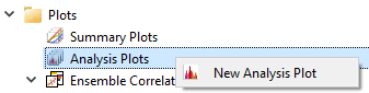
Alternatively, Analysis Plots can be created by right-clicking the Analysis Plots item in Plot Project Tree.
Having created an Analysis Plot, subitems Value Axis and Plot Data Filters emerges in Plot Project Tree. Value Axis allows for settings of title text, layout, and axis formatting. Plot Data Filters enables filtering of data.
Specifying Setup and Settings
The Analysis Plots property editor allows the user to specify a number of settings and optionally select a reference case in order to analyse vector data relatively to that particular case. The property editor groups further setup and settings as listed below.
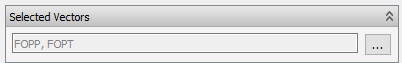
Selected Vectors
The summary data to analyze is selected by a set of summary vectors. Press the available button to activate the Summary Address Selection dialog to select a set of vectors from different ensembles, summary types and summaries.
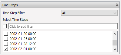
Time Steps
As shown below, a single or multiple time steps is possible to select. The timestep filter enables the user to skip time steps by years, quarters, months, weeks, or days.
Sorting, Grouping and Coloring
As shown below, the bar chart of Analysis Plots can be ordered by a major, medium, and minor grouping precedence according to the following fields:
- Ensemble
- Case
- Summary Item
- Quantity
- Timestep
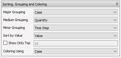
In addition, the bar chart may be colored according to these fields, sorted according to signed or absolute value and restricted to top bars.
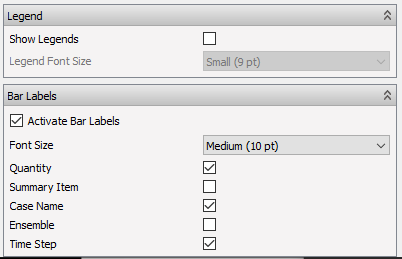
Legend and Bar Labels
Check the appropriate buttons to display the color legend for the bar chart, bar labels of interest, and font sizes.