Summary Plots
Summary Plots are a display of curves based on Eclipse Summary Data which can be combined with imported observed data, grid cell time history curve, and pasted ascii curves.
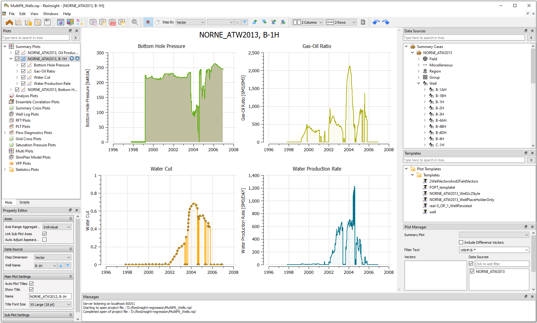
Summary plots are displayed on screen by maximum four rows by four columns of plots. In the example above, ResInsight displays two columns and two rows of plots, each plot comprising a single curve. However, a plot may contain an arbitrary number of curves. As shown in the screenshot above, essential helpers for setup of Summary Plots are:
- Plots: overview of established plots and their components
- Property Editor: settings for titles, legends, layout, axes, and appearance
- Data Sources: searching and sourcing data from case, field, regions, wells, groups, or ensemble
- Templates: overview, management and use of templates for summary plotting
- Plot Manager: powerful text-based selection of vectors for summary plotting
Essential actions are presented as controls in the toolbar to increase productivity and ease of use.
Creating Summary Plots
Using Data Sources to create Summary Plots
Having imported Eclipse Summary Data, Data Sources provides an easy approach to create Summary Plots:
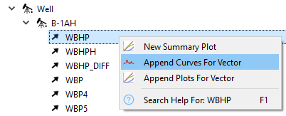
- Search or navigate Data Sources to find the desired source(s) and vector(s)
- Right-click selected vector(s) and select New Summary Plot
- Drag & Drop additional vector(s) to append curves into an existing plot or vacant plot area
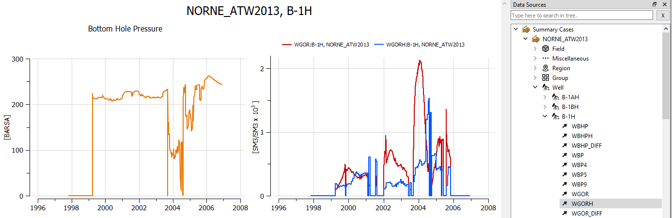
Creating a new summary plot of WBHP of Well B-1H and subsequent Drag & Drop of WGOR and WGORH into the same subplot produces the following. ResInsight will automatically make new axes if necessary. If units are the same as for WGOR and WGORH, a new axis is unnecessary.
Using Plot Manager to create Summary Plots
Having imported Eclipse Summary Data, the Plot Manager provides an alternative and powerful approach to create Summary Plots by text-based selection of data sources and vectors to plot.
Summary Plots and Functionality
Multiple Summary Plots and Curves
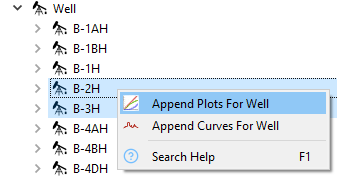
The Data Sources window enables efficient creation of multiple plots and curves by Right-clicking:
- Use Append Curves to append curves for the selected vectors into all existing plots.
- Use Append Plots for Wells to create separate plots for the selected vectors.
If a plot contains curves pertinent to a single data source, you may easily append corresponding plots for other entries of the type by right-clicking or drag and drop. In the examples above, the curves are pertinent to the single data source well B-1H. Thus you may easily append corresponding plots for other wells by right-clicking as shown below.
Alternatively, you may simply and efficiently drag and drop the selected wells into the plot area.
In fact, you may drag the entire folder
 into plot area to append plots for all wells.
Subsequently, you may:
- Adjust the number of columns and rows and preview the pages of plots using the toolbar

- Use keyboard PgUp/PgDown or scroll wheel to browse and validate the pages of plots
- Snapshot the curves or export to PDF-file via the toolbar-buttons
 or Edit menu
The data source of displayed curves is rapidly changed by Summary Plot Source Stepping.
Visual comparison of multiple summary curves
ResInsight may ease comparison of multiple summary curves by selecting a plot in Plots and using the settings in Property Editor group Axes.
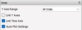
The different options are:
- Y Axis Range: Defines the data source for Y Axis range to either individual, all subplots, all wells, all regions, or all realizations.
- Link Y Axes: When checked, the axes of all subplots will be treated to obtain plots with identical axes.
- Link Time Axis: When checked, the time axes of all subplots will identical.
- Auto Plot Settings: When checked, ResInsight creates axes with titles, ranges, tickmarks, and units for best possible appearance.
Plot Mouse Interaction
- Value Tracking: When the mouse cursor is close to a curve, the closest curve sample is highlighted and the curve sample value is displayed in a tooltip.
- Selection: Left mouse button click can be used to select several items of the plot and display them in the Property Editor:
- The closest curve
- Each plot axis
- The summary plot itself if none of the above is hit and the Plots window is activated by the mouse click
- Window Zoom: Available by dragging the mouse with left mouse button pressed across plot area of interest.
- Wheel Zoom: The mouse wheel will zoom the plot in and out towards the current mouse cursor position presupposing use of mouse wheel is not disabled by toolbar button
 .
.
You may simply double click a subplot to restore its default zoom level.
Use toolbar button
 or View menu option Zoom All to restore default zoom level for the entire plot.
For scrolling multiple pages of plots by using the mouse wheel, disable Wheel Zoom by the toolbar button
.
Highlighting a curve or axis
A summary curve is highlighted when left-clicked in a plot. This eases detailed investigation of a specific curve in plots comprising many curves.
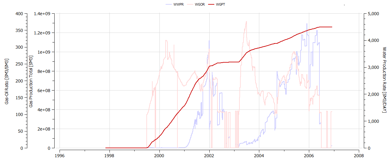
Another essential feature is to left-click an axis in a summary plot which will highlight the curves corresponding to the particular axis. As exemplified below, clicking the axis Gas Production Total highlights the WGPT curve and dims the other curves.
Summary curves can also be activated and deactivated by clicking the check-boxes in Plots window. See also Plots right-click menu items, e.g. On - Others Off which is an effective way to deactivate all curves not selected.
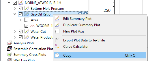
Duplicate plot, Copy and Paste
An entire summary plot may be duplicated using the toolbar button
 Duplicate Plot.
Copy and Paste of a summary plot, subplot (see below) or curve is also possible using the Plots right-click menu and standard keyboard shortcuts (CTRL-C/CTRL-V). This enables pasting a subplot or curve to wherever desired in the the Plots tree.
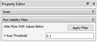
Filtering of subplots
Filtering of subplots allows the user to disable/hide subplots containing data below a user defined threshold. To activate filtering of subplots, click a plot in Plots window, set the Y-axis Threshold in Property Editor, and click Apply Filter.
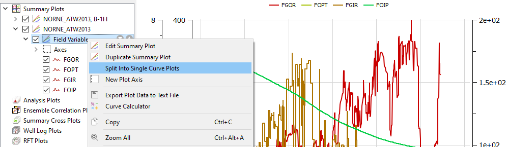
Splitting a plot into subplots
A plot with many curves can easily be split into multiple subplots. Right-click a composite plot in Plots and select Split Into Single Curve Plots to split into subplots each comprising one curve.
Accessing Plot Data
Right-clicking a plot in Plots window and selecting Show Plot Data will open a window containing the plot data as text columns. The window displays plot data by day, week, month, quarter, half year and year.
Resampling Method
-
For aggregated values (*OPT and similar), the resampled value is calculated based on linear resampling.
-
For rate values (*OPR), the total volume in the requested resample interval is computed. The rate value is then computed by
$Rate_{period} = \frac{TotalVolumePeriod}{period}$
No extrapolation of rate values is performed. This means that the rate for the last time period can appear lower than the previous time period if the last reported rate is early in the last resampling period.
The text content of this window is easy to copy and paste into Excel or other tools for further processing. It is also possible to save the text data to a file by the right-click command Export to File.
Editing Summary Plots
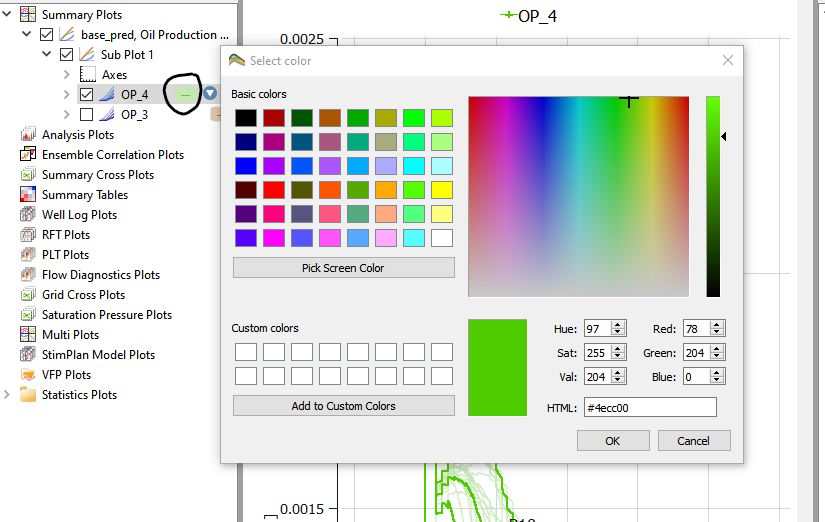
A color selection dialog can be opened by clicking on the color icon in the Project Tree.
The settings of each plot are listed in the Plots window for overview and are controlled by its sub-items and the Property Editor.
Editing a Summary Curve
By selecting a specific summary curve in the Plots window, its properties are displayed by the Property Editor.
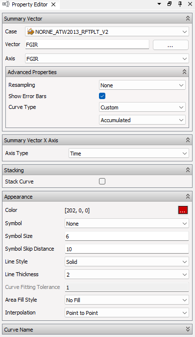
The Property Editor organizes the available options into the following groups:
- Summary Vector – Options to select case, vector to plot, resampling, axis specification, and error bars.
- Stacking - Options to control stacking of curves optionally with phase colors.
- Appearance – Options to control curve color, symbols, line style etc.
- Curve Name – Controls how the curve is labeled in the legend.
Curve Type
The Curve Type can automatically be derived based on the name of the summary vector name, either Accumulated(ends with “T”) or Rate. The curve type can be manually specified if Custom curve type is selected. This option can be especially useful for imported curves.
Other actions are available via right-click menu for selected curve. For instance, the Y-Axis for one or more curves can be switched for using the right-click command Switch Plot Axis.
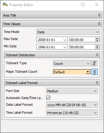
Default Time Axis Properties
Time axis properties are displayed by clicking the Time Axis subitem of a summary plot in Plots window.
Custom Time Axis Properties
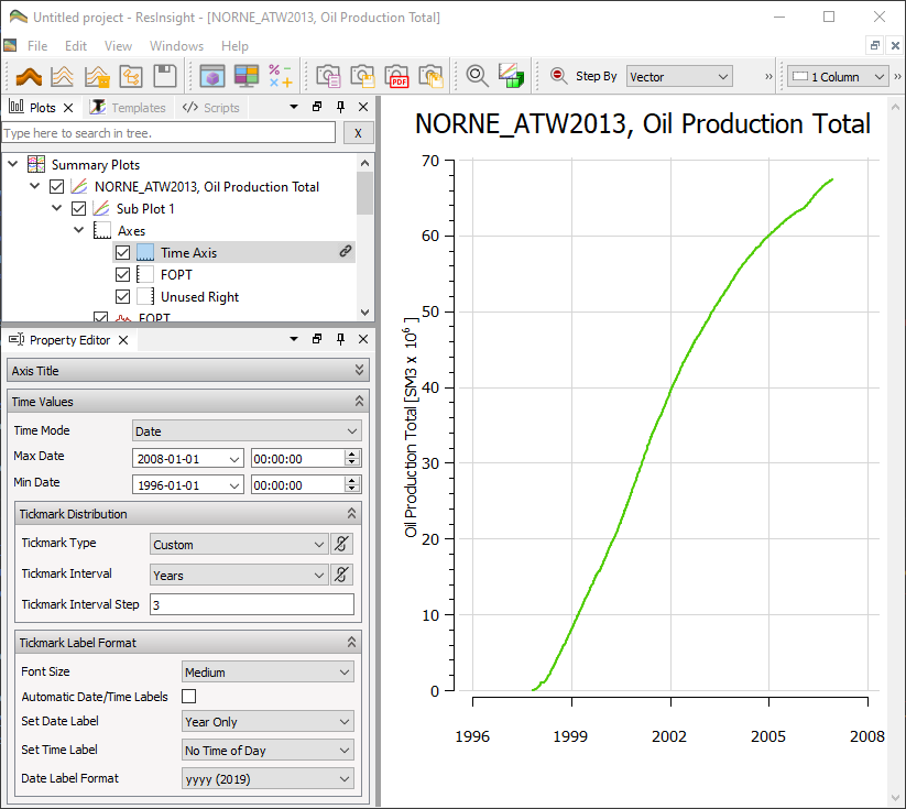
The time labels are automatically defined based on the available date range. The tick marks can be controlled in details by setting Tickmark Type to Custom. Then a tickmark interval and tickmark interval step can be defined.
In the screenshot above, the interval is set to three years, and the plot displays labesl with three years between each.
Y-axis Properties
Y-axis properties are displayed by clicking one of the left/right axis subitems of a summary plot in Plots window.
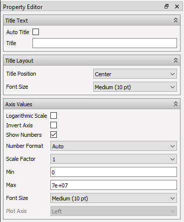
The property groups are:
- Title Text: Caters for automatic or user specification of title and inclusion of vector name, acronym, and units in plot.
- Title Layout: Positioning of title (Center or At End) and font size.
- Axis Values: Logarithmic scale, inversion of axis, legend number formatting, scale factor, max/max range, and font size.
Changing content of a Summary Plot
Right-clicking an existing summary plot in Plots and selecting Edit Summary Plot initiates the Summary Plot Editor which offers complete functionality to navigate and select vectors from all summary types.